

Development

Quick start with ECHO MCP
Local MCP server that loads Muse Design System playbooks and standards into your active LLM session. Use it in any product repo that consumes @muse-web/echo...

Web storybooks
Product storybooks for web and mobile interfaces, complete with components using React Web and documentation.

Web Foundation

MuseScore

Echo Web

Ultimate Guitar

SheetMusicPlus
App storybooks
Here you can find app storybooks with all necessary components in React Native and documentation.
RN Foundation
Ultimate Guitar
Echo RN
MuseScore

Foundation Web

MuseScore

Ultimate Guitar Web
Ultimate Guitar RN

SheetMusicPlus
GitHub readme
Components library
Under the hood, Design System components almost always use the react-aria library to ensure accessibility (a11y). Remember to add aria attributes when using components. Soon, we will conduct a large-scale site audit related to European legislation on digital product accessibility, so these attributes will need to be added one way or another.
React-Aria docs →
Architecture basis
You can learn more about our architectural framework by following the link below. This framework ensures that our Design System is not just a collection of UI assets, but a dynamic product platform with a clear model of ownership, maturity, and evolution.
Learn more about design processes →

ECHO - Github
Environment configuration,
tooling, and composition guides

You can use Echo in three proven and most common scenarios:
- using Echo directly as a framework
- copying the required parts of Echo, using them as a foundation for a custom library
- creating new components based on our code style and best practices (this requires Echo MCP to be installed).
01
Echo as a Framework. Start by using Echo directly
as a foundation for your project.
Review the available components and patterns, and build your UI using the existing system without modifications.
Learn more →
02
Echo as a Custom Base. Copy the necessary parts of Echo and use them as a starting point for your own library.
Adapt components, styles, and tokens to match your product and brand requirements.
Learn more →
03
Echo-based MCP. Create
new components following our code style and best practices.
Ensure consistency with existing patterns and architecture. This approach requires Echo MCP to be installed.
Learn more →
Our design-to-code generation flow is based on a YAML configuration that the model receives from Figma. This configuration is generated from the design and serves as a structured, deterministic input.
This approach ensures consistent and predictable output, regardless of the model used or its internal decision-making process. In addition, because the configuration already contains all the necessary UI metadata, we achieve significant token savings compared to relying solely on Figma MCP.
To generate this configuration, we built a custom Figma plugin. It encodes our design system and brand rules directly into the generation logic, ensuring that the resulting DSL (YAML config) strictly adheres to those constraints.
To receive the valid YAML and start the generation flow, the design must be finalized by the designer and marked as “Ready for Dev.”
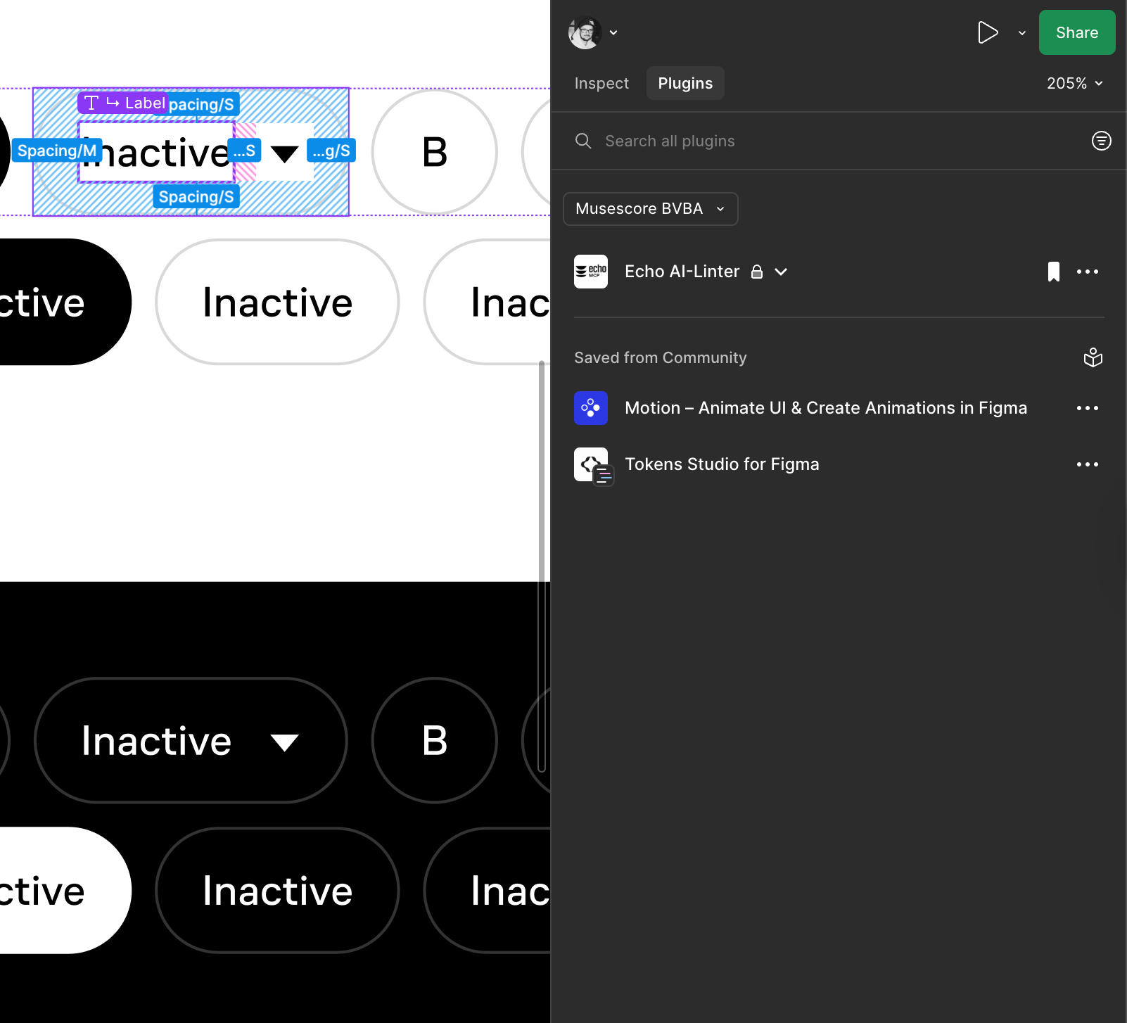
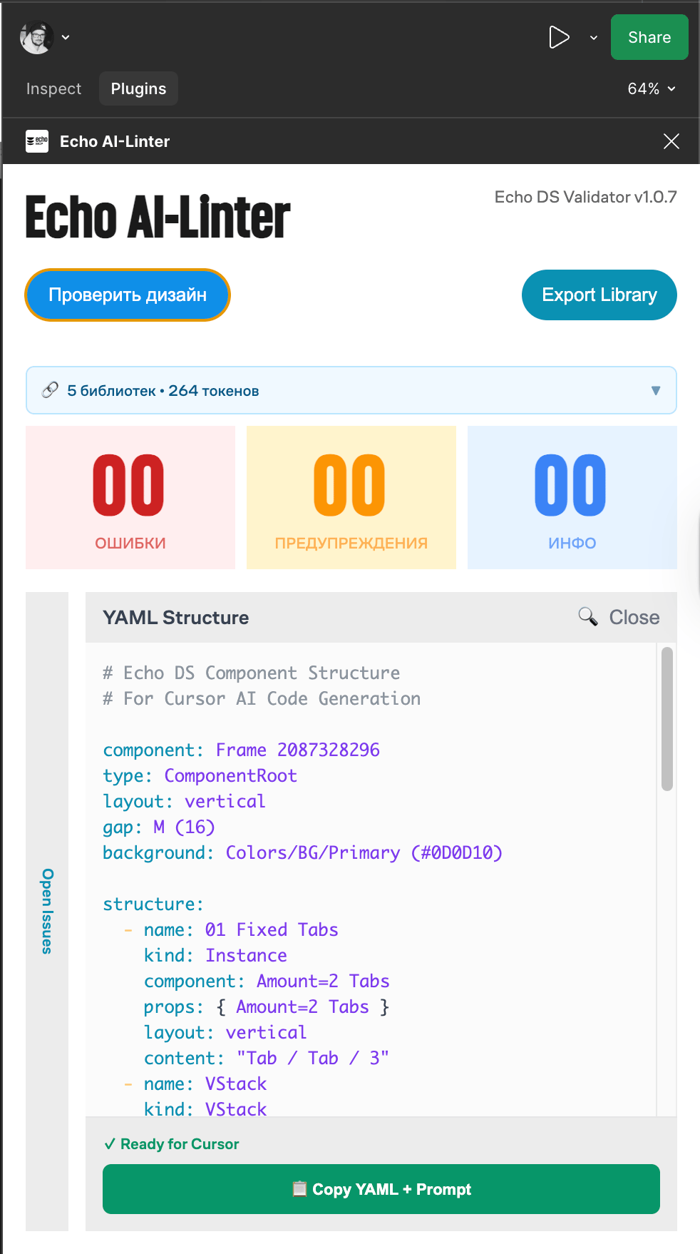
In Dev Mode, go to the Plugins tab. The Figma Linter will be available at the top of the panel by default. Activating the plugin will open it in the Dev Mode sidebar.
After launching the plugin, click “Check Design.” You will receive a YAML file. If there are any errors, you’ll need to contact the designer so they can fix the design using auto-fixes and bring it to the required structure.
If the designer is unavailable or on vacation, please leave a request for the Design System team — we will prepare the YAML for you.
If everything goes well, take the YAML and use it to compose your prompt for the model.
If you have any questions, please ask them in the relevant DS chat — you already know which one 🙂
You can still copy the config even if there are errors. All the necessary metadata will be included anyway. However, accuracy is not guaranteed in this case, and the model may produce hallucinations.
YAML serves as a portable, structured representation of the design:
- easy to parse and validate
- human-readable
- compatible with downstream processing (DSL → LLM → code)
Don’t overload the model with multiple tasks. One prompt — one task.
If you’re generating UI, focus only on that. If some components or parts of the UI are missing, first create them locally. Then, in a separate step, refine those components according to the standard — add API, props, stories, and integrate them into Storybook.
Use Figma MCP to get design reference
@https://www.figma.com/design/HhmldPtFFE4Pp2LiY0R2cH/MCP-Concept?node-id=468-1234&m=devBuild pixel perfect UI using dsl yaml config
REPOS/frontend-ultimate-guitar/dsl-config.yaml
Use product ds library for components, tokens, icons/Users/dmitriykrikunov/Documents/REPOS/frontend-ultimate-guitar/packages/ds
If something missed build it using ds code style as a main reference and do that locally first\* Place product context here related to the task\* Place architecture and environment context or any other instructions AI should know

Copy Figma MCP link from Figma dev Mode. MCP should be enabled.
Create locally temproray .yaml file and insert there yaml config provided by Figma plugin
Create locally temproray .yaml file and insert there yaml config provided by Figma plugin
Give AI instructions create missed components based on ds code style, tokens system and rules
Give AI instructions create missed components based on ds code style, tokens system and rules
Simply copy the prompt template and replace it with your own data. It’s important to keep the structure and flow intact so the model can access the right sources in the correct order and gather the necessary context.
When writing styles in the product, ALWAYS use DS tokens as CSS variables. Never hardcode hex or rgb values. If you can’t find the right token, post here and mention the design’s author — most likely it’s a design oversight.
Work with design
When you start working on a design, use Figma’s “Dev mode” and identify the components you need. In dev mode it’s much easier to identify component names, props, color and text tokens, etc. If you don’t have access to Figma Dev mode, you can ask “Dev mode” rights via this request page.
If a current component is missing something, has a bug, or doesn’t match the design—again, post in this channel with a description of the problem.
Define a problem → Send us request →
→ We will make an update → Final review
Create request
Doesn’t work?
If a current component is missing something, has a bug, or doesn’t match the design—again, post in this channel with a description of the problem.
Types of Bugs
If you see a visual bug:
First, try to do a quick investigation using Dev Tools—at least follow the class chain to confirm whether the issue is definitely on the Design System side.
If the bug appears in logs:
Again, perform a minimal inspection first, then post a bug report in the Slack channel.
Note: If you see react-aria in the logs, it doesn’t necessarily mean the bug is in the Design System—it could be something outside the component that just happens to include it in the stack trace.
If it’s a functional bug:
Similarly, first check if it works in Storybook. If it does, figure out why it works there but not in production.
- Critical + you’re 100% sure it’s the Design System or you’ve gone through the above steps and still need help—post a report in the Slack channels and mention us so we can respond faster.
- Minor—after doing the steps above, just write a brief report.
- If the bug relates to hidden functionality, modals, or monetization layers—please include direct links to the relevant pages and how to reach them (query parameters or any shortcuts if available). I spend a lot of time just trying to recall or figure out how to access certain modals. If it’s a Design System developer from another product, they might not understand at all.
Contact us in case of question
We welcome you to share any feedback or ask any questions related to the product development process using the design system! Feel free to DM me at d.krikunov@mu.se.

In case of questions
These channels will help you find answers to any questions related to the design system or surrounding topics. Please feel free to share your ideas and problems here:
Channels:
#ug-design-system
#ug-design-system
#mu-design-system
#au-design-system