

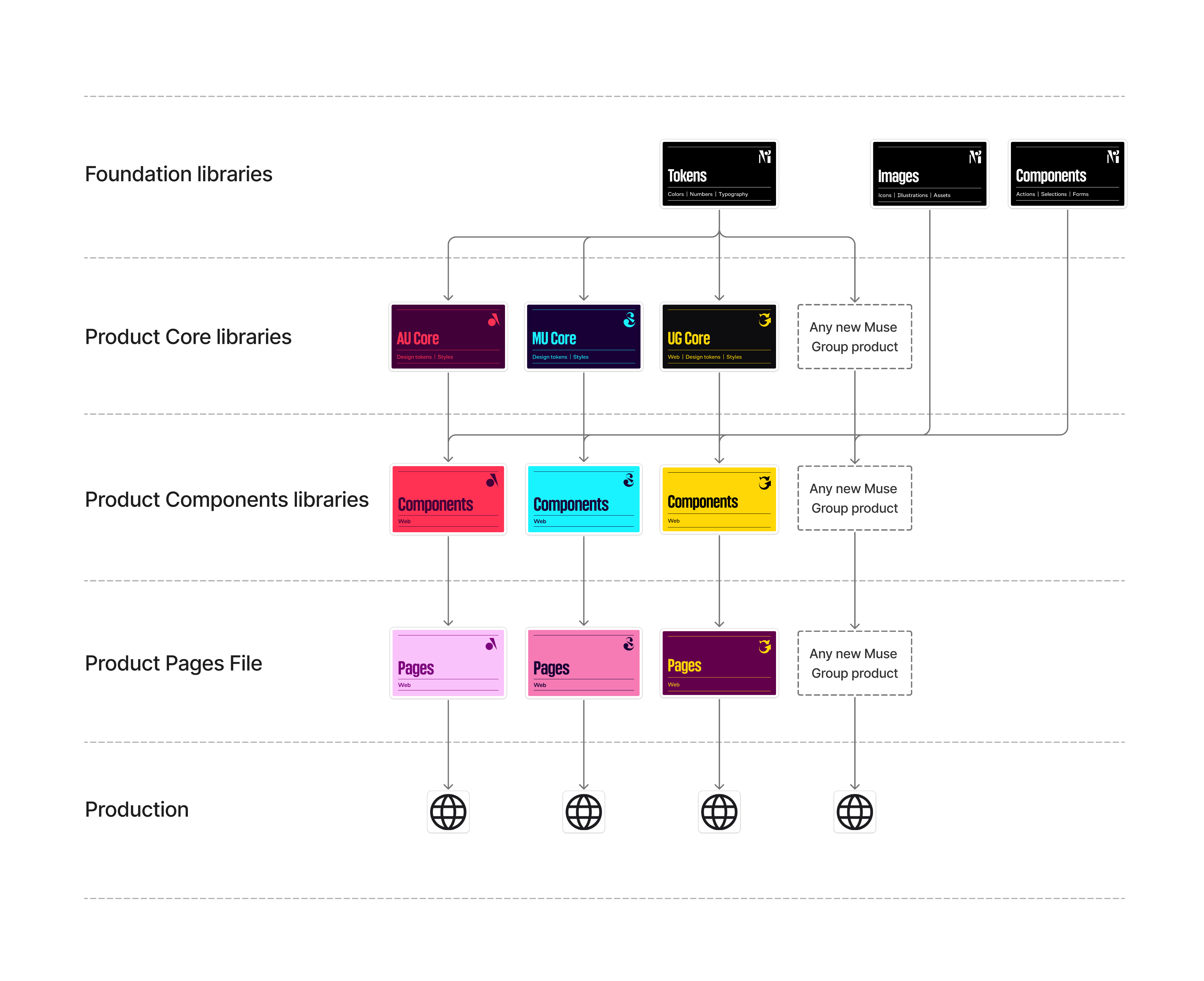
Figma Libraries
The structure of Figma projects and files in our company is intentional, shaped by our experience and the needs of our products. Design files and libraries can be categorized into types.
- Tokens library
- Images library
- Components library
- Core library
- Components library
- Pages file
- Core library
- Components library
- Pages file
- Design files

Ultimate Guitar


MuseScore Studio


Foundation libraries
Foundation tokens
Storage of color semantic & typography
Explore
Components
Headless components which lays at the basis of product components
Explore

Common assets
Icons, illustrations & other assets
Explore
Foundation tokens library
The library stores primitive-level tokens.
- Number tokens can be used for sizes, spacing, font parameters, corner rounding, and more. Color tokens are applicable in semantic color palettes for company products or branding tasks. Typography tokens help create various typography styles for our products.
The library stores all images reused in our products.
- Interface icons, social media icons, illustrations, product logos, and Figma file cover templates are included.
Foundation Components library
The library contains a set of basic interface components used in our products without fundamental changes.
- Buttons, selection controls, text fields, badges, tooltips, and modal windows are part of our offerings.
Product component libraries
Product Core library
This type of library contains tokens and styles directly used for product needs. All styles and variants are based on primitive tokens from the Muse Token Foundation. The bark libraries include:
- Indentation tokens, state tokens for active clickable components, corner rounding tokens, a semantic color palette (linked to an article describing semantics), text styles, and effect styles (such as shadows and blur) are included.
Product Components library
Each product has its own unique structure grouping components. By emphasizing common points across our products, we can create a list like this:
- Action, input, selection controls, navigation, content, information, and primitives are key components.
Product Pages files
The file structure reflects the actual product structure.
Product spaces with design files
This contains design files with new features and experiments, with one file per task. There are two types of files: Product design files and Grow design files, each with a specific structure as detailed in the Templates section.
Logic for joining libraries in existing projects
The Muse library design linking scheme applies to both existing integrated products and new products.
Contact us in case of question
We welcome your feedback or questions related to the product development process using the Design System! Feel free to DM me at d.krikunov@mu.se.

In case of questions
These channels will help you find answers to any questions related to the Design System or surrounding topics. Please share your ideas and issues here.
Channels:
#ug-design-system
#ug-design-system
#mu-design-system
#au-design-system